Coursework Research.
The bold
and vibrant colours used on the shield in this logo helps to make it stand
out against the sky blue background. The blue in the background of the shield
helps it to further stand out as the blue and yellow/gold complement one
another. The gold used on the shield is very rich and this helps to cement the
quality and purity of what they are going to produce. It guides the audience
into understanding that Warner Bros are good and thus not going to disappoint.
The logo homes quite an eerie atmosphere and the cloudy background creates a
mystic and intriguing feeling.
Four brothers founded
warner Bros and the shield represents their unity. They produce a variety of
genres and their logo helps them to do so as it doesn't signify/resemble one
genre, they can release many.
Created by A
TimeWarner Company, one of the largest network and Film Company, Warner Bros
Pictures is also one of the major film studios.

The Walt Disney logo
demonstrates the kind of films that they are going to be producing and
releasing. It is a very mystical scene as the fairy tale/princess castle with
the stars in the sky around demonstrates. This insinuates that
the film genres they focus on are fairy tales and fantasy; ones that appeal
to young children. The vibrant pinks and blues that are predominantly being
used also attracts young children. They're very cool and fun colours but
have been gender stereotyped; blue for boys and pink for girls. The fact that
these colours are used prove that their films are for both genders which may
not have originally been clear, due to the use of the princess' castle. The
font of ‘Walt Disney’ is quite interesting and fancy; it appeals to the audience
as it is aesthetically pleasing. If they had used a different font it would
have made the logo look boring and thus less appealing.

Columbia Pictures is an
American film production company who produce a mixture of films and are not
focused on one specific category. The logo of the woman holding a torch
whilst being draped in the American flag is not the original, the logo has been
edited multiple times to fit the time of society of which it is in (zeitgeist).
The block writing of 'COLUMBIA' helps it to subtly stand out, enough to be
obvious but not too much to take away from the woman. The torch that she is
holding is letting off rays of light, which fall either side of her to add to
her emphasis. There are also two rainbow semi-circles around the light source,
which provides a serene setting to this logo. It is obvious that their films
are not focused on one genre, as the logo is ambiguous in stating it.

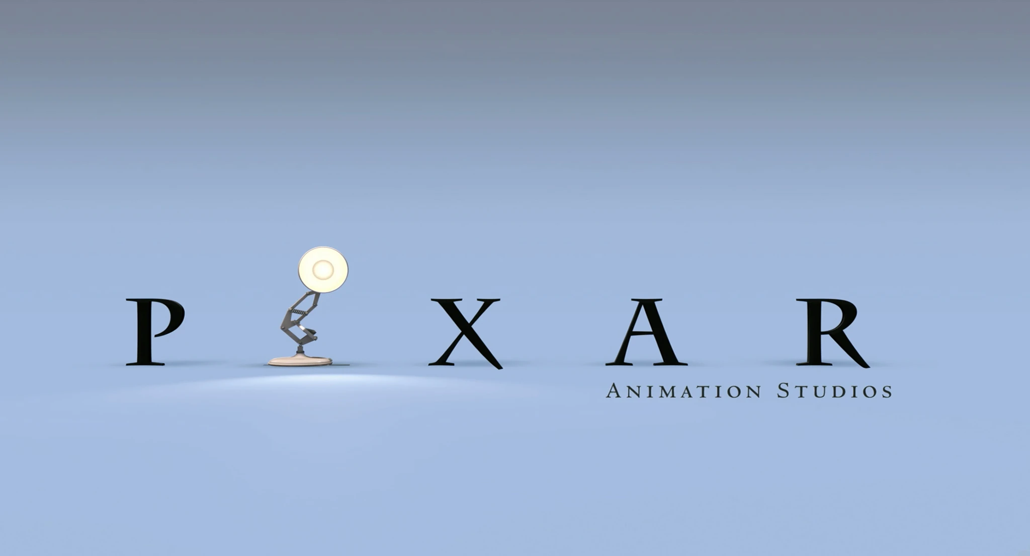
Pixar Animation
Studio's produce animated films and these films are mainly aimed at children.
The logo is very simplistic and the sharp font used to write 'PIXAR' makes it
stand out. Halfway through this animation the 'I' is replaced with a lamp, this
makes the logo fun and takes it from being simplistic and boring to being quite
amusing and enjoyable; it brings excitement. The off-white, grey colour used
for the background compliments the black words and it matches the colour of the
lamp. This makes the logo cohesive as it all blends. The shadow used behind
each letter adds emphasis to the word. Coming from the lamp that is shining
ahead, the shadow gives it a sense of reality because when a light is on, it
creates a shadow.

Polsky Films is a film production company based
in Los Angeles, created by brothers Alan and Gabe Polsky. Some of the films
that they have produced include Bad Lieutenant: Port of Call New Orleans and
The Motel Life. They specialize in feature films and the majority of their
filmography is drama films. This logo is
very plain, with a cream background that looks quite ‘smoky’ and blurred,
giving it a very chilling and unsettling vibe. The unusual block writing that
reads ‘POLSKY’ is quite fun, yet eerie and mysterious. The colour base is very
simple which also adds mystery because nothing in the logo is given away,
meaning that it does not advice the audience on what to expect. Although a very
simple design, this logo carries a level of complexity as the obscurity means
that it is hard for people to understand.

This is my logo
design for ‘The Little Picturehouse’. It is a very simplistic yet effective
design. I decided to keep the colours all very similar with everything being a
different shade of grey. I chose a house to be the image in this logo because
it links with the title, ‘Picturehouse’ and I believe that audience will be
able to relate the two together. The lines that encase the house are a literal
representation that ‘The Little Picturehouse’ is an independent film company. The
inconspicuousness of this logo design allows me to explore a range of genres
when creating my film.
The Art of Getting By
is a drama, indie and romantic comedy film. An establishing shot is immediately
used to proclaim the fact that it is set in New York. This gives the audience a
sense of scope, which aids their understanding and knowledge of what they are
about to watch. It begins with George Zinavoy (the protagonist) walking through
Manhattan to the school that he attends. During this, a voice over is used –
George has a monologue in which he explains his view on life (how meaningless
and futile it is). There is no other speech only the gentle melody of a guitar
playing a song. The faint sound of city noise is then added, traffic and the
murmurs of peoples conversations. The use of sound in this scene is very
effective and worthwhile; it immediately creates a personal touch to the film
as it allows the audience to connect with the main character, George.
Before the camera
shows George walking through Manhattan, three establishing shots are used and
they each show different set of buildings, from this the audience can confirm
that they are in New York.
The piece of film
that I am going to be creating is going to be a drama, indie film and I want to
adapt the technique used in this film to my own. I like the idea of having a
voiceover connecting with the audience whilst the visual story is being played.
Establishing shot to
capture and set the scene.
In these two clips,
the only sound is his monologue and the gentle background guitar music. This
gives quite a peaceful, serene and relaxed atmosphere to the opening that is
predominant throughout.
In these next two
clips as well as his monologue and the sound of gentle music, the city noise begins
to kick in providing a sense of reality. It makes the audience understand that
they are going to be able to connect to the characters and story line.
Another film, that I
feel is going to guide me when I make my own film is The Perks of Being a
Wallflower which is a young-adult fiction, drama film. The first shot is
different to the previous film as it is not an establishing shot – for the
first minute and 10 seconds of the opening sequence, all we see is a first
person shot of a bridge and then the ceiling and wall of a tunnel. During this,
we (the audience) are moving at steady pace, as if we were in the back of a
moving vehicle. This adds a sense of mystery and curiosity, as people do not
know where it is set/happening. During this, the only sound is a song by The Samples,
which is used to brighten and set the mood, quite melancholy and reserved. I plan
on using a song as the background sound to help me set the ambiance and to tell
my message. I feel that sound and music is key when trying to set a specific
feeling/vibe as the audience are all able to connect/relate to it on different
levels.
Moreover, alike The
Art of Getting By, this film uses a voice over at the beginning of the film to
tell the story. Whilst Charlie is busy writing to his pen pal, a voice over is
used (he is speaking) to tell us what he is writing. The shot cuts from him
sat, writing at his desk to him walking throughout his house and then it
returns to him back at his desk. He is then walking through the school hallway
whilst the people all around him are celebrating; the school bell then rings,
his speaking halts, and all of the school students around are causing havoc. He
continues with what he was saying. The film then begins with the story of his
first day and the meeting of his to-be friends. Mixed with The Art of Getting By, I plan on
using these techniques to create mine.


During these dark and
eerie shots The Samples – ‘Could It Be Another Change’ is playing. These shots
are the first we see when watching this film and the darkness of them imply
that this film is not going to be very uplifting or joyous but in fact quit
serious and sorrowful.
During these scenes,
Charlie is reading aloud his letter (non-diegetic) whilst the visual story
continues playing.
The final film, The
Breakfast Club a teen-drama film, begins differently to the other two. The
first shot is an establishing shot that shows a high school. This informs the
audience that this is where the film is primarily going to be set. Prior to
this shot however, is a black screen with a quote written across. The screen
then breaks as though it is made of glass and then behind the school beings to
appear. Along with the use of the sound of breaking glass, this clip is very
effective at engaging the audience and grabbing their attention.
By using this quote,
it ensures that the audience can understand more about the film even before
they have watched it.
 The camera then zooms into the establishing shot, the music fades into
the background and a voice stating the date and location becomes audible. A series
of close up shots are to follow, including one of the clock, hallway and
cafeteria before a letter is read aloud (that we later come to learn is written
at the end of the film). As the different characters are announced, a multitude
of close up shots are again used but this time to show places that describe who
each characters is and what they represent. The character who is doing the
speaking is Brian Johnson who later turns out to be the one who wrote the
letter.
The camera then zooms into the establishing shot, the music fades into
the background and a voice stating the date and location becomes audible. A series
of close up shots are to follow, including one of the clock, hallway and
cafeteria before a letter is read aloud (that we later come to learn is written
at the end of the film). As the different characters are announced, a multitude
of close up shots are again used but this time to show places that describe who
each characters is and what they represent. The character who is doing the
speaking is Brian Johnson who later turns out to be the one who wrote the
letter.


The music used is the
iconic song of this film Simple Minds – Don’t You (Forget About Me). The last
few minutes end the same with Brian Johnson reading out the letter that he
wrote and the music is playing in the background too – the only difference is what
we see. At the beginning it is many different shots that show who the
characters are whilst it ends with the teacher reading his letter and John
Bender (another character) walking across the school field.
Little White Lies, (http://lwlies.com/magazine/) established in 2005 is a print magazine that
advocates great movies and the talent people who make them. It is based in
London but it international. It can be found in leading book stores and
specialty shops. Alongside having a magazine, they have an app and a book.
Additionally, they can be found through their Instagram or YouTube account.
They publish a new magazine six times a year and you can also subscribe to them
in order to pay for and thus receive through delivery.
The front section of
their magazine they use to promote upcoming releases whilst the back section is
devoted to reviews of the latest theatrical releases, exclusive interviews,
festival reports and more.
The magazine is quite
unconventional. By using bright, bold colours they are going for a daring
approach as some may find it distracting. However it is also very aesthetically
pleasing to others as the vibrant colours make them more interested to read it
and thus they will enjoy it more.
These designs are all
examples of their past work. You can see that they have not undertook the usual
design of having it quite plain and using many taglines to entice the
reader/inform them on what is to be included. Instead, they have made it fun
and exciting through their use of the animated images and bright colours. Also,
on the majority, they do not include any of the inside stories on the front
cover. Excluding a few (and these examples one) they keep it very mysterious,
the audience may find this interesting as they are curious to find out what is
included.
The inside pages are
just as visually fun and pleasing the use of pictures and colours makes the
pages more enticing and intriguing.
When creating my
magazine, I intend to escape the norms of the layout. My aim is for it to be
daring, fun and unconventional. By steering away from mainstream layouts, I
hope for my magazine to be aesthetically pleasing resulting in it raising more
interest than normal.
Here are some
magazine layout ideas that I am going to take into account when I create my
own. My aim is to go for an unconventional yet aesthetically pleasing layout so
as to stand out from the crowd but also still reach the same audience. I feel
that the conventional layouts are not as aesthetically pleasing as the
unconventional yet they are more common as people are comfortable and familiar
with them and tend to be deemed the ‘safer’ option. Furthermore, with making it
aesthetically pleasing I believe that the audience will find them more
enjoyable and entertaining, thus becoming more engaged in the story and
message.
Another international
film magazine is Sight & Sound. This one is more conventional as the
colours they use are not as daring and they typically include taglines to
inform the reader of what is inside.
They focus their
magazine articles on whatever is prominent at the time. For example, in
December 2015 their magazine includes articles stating the best films from this
year. They keep their magazines up to date with the zeitgeist.
By focusing their articles
on up-to-date and relevant film related topics, e.g. film of the week,
legendary actors/actresses’ and favourite directors, they are providing their
audience with a wider range of entertainment, in the hope that they will enjoy
it. Furthermore, by including such an array of topics they are also reaching
out to different people, which will result in a wider audience base. If they
focused solely on one topic however, they would only reach a select group of
people who would appreciate their work.
This magazine is very
effective and clear at getting across their message or story that they are
trying to sell.
Their article layout
is typically different to that used by Little White Lies. Instead of using many
pictures and bold colours, they keep it simple and plain.
This article is very
conventional with the plain, non-distracting white background, columns of text
and a few pictures included. This technique is effective when copying the
mainstream, however I believe that unconventional is more appealing. The
sophistication of their writing implies that their target audience are people
who enjoy film and are typically quite matured and cultured.
The final film
magazine that I am going to look at is Universal Film Magazine (UFM). They are a
free film magazine who provide a passionate and creative coverage to global
films and festival communities. By upholding a high standard in professional
journalism with factual, unbiased stories they are able to be the third party
on important and undecided topics. By providing only fact-based information it
means that they are very reliable and thus carry a high sense of
representativeness. This in turn raises their credibility and status.
Their cover page is
very bold and eye-catching which will appeal to a young audience as it gives
the insinuation that it is an enjoyable magazine.
The double pages that
are within this magazine are also appealing to a younger audience as there is
not a great amount of writing; thus readers will not be as disheartened as if
the pages were just covered in writing. The pictures also break up the text
will additionally makes it appealing and inviting.
My aim is to apply
the use of images in my work to break up the text and to not have blocks of
writing covering my pages too. This, I hope, will attract more people to read
it and thus find pleasure and knowledge from it.
My target audience is
fairly vast, aged between 15 and 21; no gender specifics as it will be
relatable for both girls and boys. I am not excluding an older audience from
watching and enjoying my film, however I just do not believe that they will
appreciate it as much as the younger generations as it will focus on things
that are past their time and subsequently their knowledge and understanding.
To conclude, this
research has allowed me to explore different ideas that I aim to undertake when
I create my own 3-minute opening film clip and my magazine pages. Furthermore,
I now feel as though I understand certain choices that are made in the creation
of media products e.g. films and print and thus the effect that each have on
the intended audience.


